
Some colors whisper. Bubblegum pink shouts — and somehow, everyone listens.
It is one of those rare shades that shows up everywhere without ever feeling overplayed. You spot it on a designer runway in Milan, then on someone’s accent wall in a studio apartment, then on the feet of a sneakerhead walking through a mall. It is cheerful without being aggressive, bold without being loud, and nostalgic without feeling dated.
This color has a life of its own. It has survived multiple decades, made a dramatic comeback in the Y2K aesthetic revival, and cemented itself as one of the most sought-after shades in fashion, interior design, and digital branding. It even earned its own chapter in sneaker culture through the Jordan 5s — a colorway that took streetwear by storm and still commands serious resale value today.
This article covers everything you need to know. What makes this color unique at a technical level. How it became a cultural symbol. How to wear it, design with it, and style it. And a full breakdown of the sneaker world’s most beloved pink silhouette.
If you have ever been drawn to this shade and could not quite explain why — you will have answers by the end.
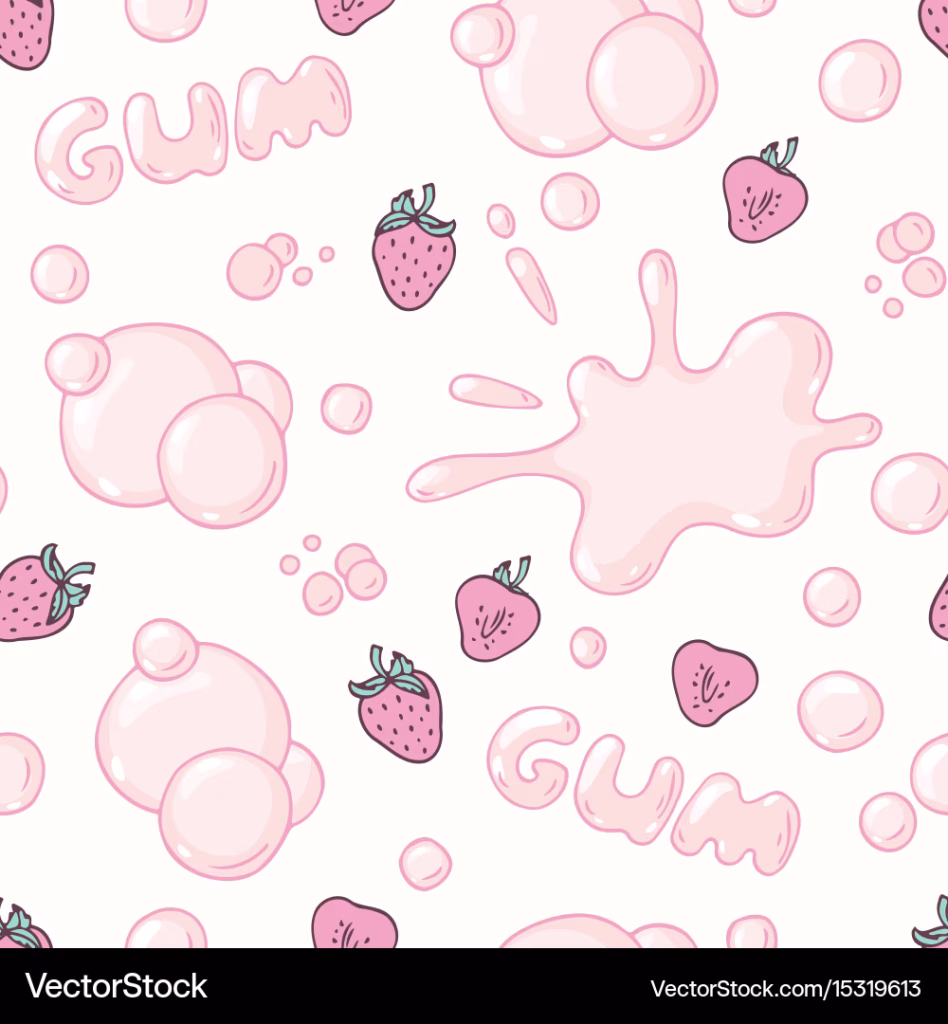
What Is Bubblegum Pink? Understanding the Color and Its Hex Code
Not all pinks are created equal. This is a truth that designers, stylists, and color theorists will repeat until they are hoarse. And nowhere is the distinction more important than when separating bubblegum pink from its closest relatives.
Defining the Exact Shade
The color sits in the warm-light category of the pink family. It is lighter than hot pink, warmer than baby pink, and far more saturated than millennial pink. The name comes from the iconic shade of classic American bubble gum — that sugary, rubbery sweetness translated into a visual experience most people recognize instantly.
In technical terms, the shade lives closest to the hex code #FFB7C5, though you will also see it referenced as #FF69B4 (hot pink) and #FFC0CB (generic pink) depending on the platform. Different design tools interpret it slightly differently, which is why you might see minor variations between Adobe Illustrator, Canva, Figma, and Procreate. The most accurate and widely accepted bubblegum pink hex code for digital design work is #FFB7C5.
RGB and HSL Breakdown
For developers and digital artists working across color systems, here are the exact values:
- RGB: R: 255, G: 183, B: 197
- HSL: Hue 349°, Saturation 100%, Lightness 86%
- CMYK (print): C: 0, M: 28, Y: 23, K: 0
These values give you consistency across platforms, whether you are building a website, designing packaging, or creating social media assets that need to match your physical materials exactly.
How It Differs From Other Pinks
Baby pink is softer and has more white mixed in — it is the color of a nursery. Hot pink is darker and more intense — it is the color of a neon sign. Millennial pink has a dusty, muted quality — it is the color of minimalist branding. This shade sits confidently between all of them. It is vibrant but not harsh. Sweet but not babyish. It is the look that says fun without being chaotic.
When choosing colors to pair with it, white and ivory keep things clean and classic. Caramel and warm browns give it a retro feel. Slate gray and charcoal create strong contrast without the severity of black. Pairing it with red is possible but risky — the result can easily tip into a Valentine’s Day cliché.
The History and Cultural Rise of Pink Bubblegum as a Color Identity
Colors do not just exist — they accumulate meaning over time. Pink bubblegum as a color identity has been accumulating meaning for the better part of a century.
From Candy Aisles to Catwalks
The association between this shade and the candy itself dates back to the 1940s and 1950s, when brands like Bazooka and Double Bubble were defining American childhood. That specific tone of those early gum wrappers lodged itself into collective memory. It was playful, sweet, and distinctly carefree.
By the 1960s and 1970s, pink in general began its complicated journey through gender politics. It became heavily associated with femininity in Western markets, which created a backlash that would last decades. But this particular shade retained something different — it held onto its connection to childhood joy rather than becoming purely a gender signifier.
The 1980s saw it appear across pop art, music videos, and fashion in ways that felt deliberately bold. Artists and designers who used it were making a statement: this shade is not delicate. It is punchy.
The Y2K Revival and Gen Z’s Reclamation
Fast-forward to the 2010s and the color started showing up in a new context entirely. The Y2K aesthetic revival brought with it a love of all things bold and nostalgic, and this shade fit perfectly. Gen Z embraced it not as a “girly” color but as a power statement — an act of reclaiming something previously dismissed and turning it into something intentional.
Social media amplified everything. Flat-lay photography backgrounds, beauty packaging, GRWM videos, and aesthetic Pinterest boards all fed the color’s second rise. When the Barbie movie released in 2023, it poured gasoline on an already burning trend. The entire promotional campaign was built around pink, and suddenly even people who had never considered the color found themselves reaching for it.
Today it appears across menswear, genderless fashion, luxury accessories, and streetwear with equal ease. It has shed the limitations that people once tried to place on it.
Bubblegum Pink in Fashion: Styling Tips That Actually Work
Loving a color is one thing. Knowing how to wear it well is another. Here is what actually works when building outfits around this shade.
Best Color Pairings for Everyday Outfits
The easiest and most reliable pairing is white. A top in this shade against white trousers or a white blazer is clean, modern, and effortlessly stylish. It works in summer and transitions well into lighter spring layers.
Caramel and warm tan shades create a retro-toned palette that feels intentional rather than accidental. Think a chunky pink knit with camel-colored wide-leg trousers — it is the kind of combination that looks curated without being overdone.
Slate gray is underrated as a partner. The cool neutrality of gray grounds the warmth of the pink and creates a sophisticated contrast. This pairing works especially well in professional settings where you want color without maximalism.
Black is an option, but it can feel blunt. If you are going black and pink, ensure there is a third element — texture, a print, or an accessory — that softens the stark contrast.
Styling for Different Skin Tones
Bubblegum pink is genuinely versatile across skin tones, but the way it works varies. For those with cool undertones — meaning your veins appear more blue or purple — this shade is extremely flattering because it shares those cool-warm qualities. For those with warm undertones — veins appearing more green — a slightly warmer version leaning toward peach will feel more natural. Those with neutral undertones have the most flexibility and can wear almost any version of the shade.
The key is not to shy away from it. Many people dismiss pink for themselves without ever actually trying it against their skin in good lighting.
Seasonal Styling
Spring and summer are obvious seasons for this color, but it holds up in cooler months too. A chunky pink knit over dark denim in autumn creates a mood entirely different from a sleeveless version in July — both are valid, both are strong. Winter works when you treat the color as a coat or accessories rather than building a full outfit around it.
The Bubblegum Pink Jordan 5s: A Sneaker That Became a Cultural Moment
No conversation about this color in recent years is complete without talking about sneakers. And no sneaker has carried this shade more boldly than the Jordan 5.
The Origin of the Colorway
The Jordan 5 silhouette was originally designed by Tinker Hatfield and first released in 1990. It is one of the most recognizable sneakers in history — the shark teeth midsole, the lace locks, the netting on the upper. When Jordan Brand began experimenting with non-traditional colorways, the Jordan 5 became a canvas that could hold bold color choices without losing any of its structural identity.
The pink upper against the translucent sole and icy outsole creates a color-blocking effect that feels both retro and modern. The reflective tongue patch catches light in a way that elevates the entire shoe. It is not just a colorway — it is a full design conversation.
The AWAKE NY x Bubblegum Pink Jordan 5s
The collaboration between AWAKE NY and Jordan Brand produced one of the most talked-about sneaker releases of recent years. AWAKE NY, the New York-based streetwear brand founded by Angelo Baque, brought its downtown sensibility to the Jordan 5 silhouette, and the result was striking.
The Awake bubblegum pink Jordan 5s did not just apply a color to an existing shoe. The collaboration involved genuine design refinements — tonal stitching, co-branding details, and premium suede applications — that made it feel like a real creative partnership rather than a licensing deal. The resale market responded accordingly. Pairs that originally retailed around $225 were trading at two to three times that value within weeks of release.
What made it culturally significant was the combination of audiences. Jordan Brand’s legacy sneakerhead community and AWAKE NY’s streetwear and art crowd came together around a single shoe, united by a color that neither demographic would have predicted owning five years earlier.
Design Details Worth Knowing
If you are looking at these sneakers — whether buying new or on the resale market — here are the design elements to understand:
- The upper uses a mix of mesh netting and synthetic overlays in pink
- The midsole features the classic shark teeth design rendered in a complementary tone
- The outsole is translucent or icy, creating a contrast that is signature to this colorway
- The lace locks and hardware carry matching or tonal detailing throughout
Authenticity Guide: Spotting Fakes
The demand for this colorway has made it a target for counterfeiters. Key things to check: the stitching on the shark teeth midsole should be consistent and tight with no loose threads. The heel tab logo should be sharp and correctly proportioned. The box label should match the pair exactly — color, size, and model code. On authentic pairs, the translucent outsole will have a clean, even tint with no bubbles or cloudiness. The netting on the upper should feel structured, not soft and floppy.
Where to Buy and Current Pricing
Retail through Nike SNKRS remains the first and best option when drops are active. On the resale market, StockX and GOAT are the two most reliable platforms for verified pairs. Local sneaker boutiques and consignment shops are also worth checking — prices there are sometimes negotiable in ways that platforms are not. Pricing fluctuates, but expect to spend significantly above retail for sought-after sizes in good condition.
Bubblegum Pink in Interior Design and Brand Identity
The shade does not stop at fashion. It has made a powerful case for itself in physical spaces and corporate identity as well.
Using It in Home Interiors
As an accent wall color, this shade works best in rooms that receive natural light. North-facing rooms can make it feel slightly cold and off. South or west-facing rooms bring out its warmth beautifully. In a living room or bedroom, pair it with natural wood tones, cream textiles, and brass fixtures for a look that feels curated rather than costume-like.
As furniture — a sofa, a velvet armchair, a headboard — it becomes the focal point of the room. Everything else should stay muted when that is the choice. Let the color do the talking.
Brands That Built Identity Around This Shade
Glossier built a beauty brand largely on the back of soft pinks close to this family. Their packaging, store interiors, and social media presence use the shade to communicate approachability and modernity. Kylie Cosmetics went bolder with more saturated versions to communicate confidence and drama.
What both brands understand is that bubblegum pink communicates something specific: fun, self-assured, feminine but not fragile. It is a color that customers associate with positive emotional experiences, which is why product photography in this tone tends to perform well on social platforms.
Digital Design Applications
For designers using the bubblegum pink hex code in digital work, the color photographs extremely well against white backgrounds. In UI design, it works as an accent or CTA button color rather than a full background. In social media graphics, it has proven conversion-friendly in the fashion, beauty, and lifestyle categories. Keep contrast ratios in mind — light pinks need dark text to remain accessible.
The Psychology Behind Why This Color Feels the Way It Does
Color psychology is not just academic. It explains why people respond to certain shades in ways that feel almost involuntary.
Pink in general is associated with warmth, openness, and emotional softness. Unlike red — which accelerates heart rate and signals urgency — pink creates a calming but inviting environment. It lowers tension without inducing drowsiness. This is why retail environments, particularly in fashion and beauty, lean into pink so heavily.
This particular shade carries nostalgia as an added layer. For most people, it triggers early childhood associations — candy, playgrounds, birthday parties. That emotional recall creates an instant positive impression that is difficult to manufacture with other colors. Marketers who understand this use the shade not to target a demographic, but to trigger a specific feeling.
The Baker-Miller pink experiment from the 1970s showed that certain shades of pink can reduce aggressive behavior in short-term settings. This shade is brighter and more vibrant than the pink used in those studies, so the clinical calming effect is less pronounced — but the baseline warmth and approachability of the color family still applies in everyday environments.
Getting the Perfect Bubblegum Pink: Hair, Nails, and DIY Projects
For those who want to wear the color rather than just live around it, the options have never been better or more accessible.
Achieving This Shade in Your Hair
To get a true version of this shade in your hair, the starting point matters enormously. The lighter your base, the truer the color will read. Ideally, aim for a level 9 or 10 bleach lift before applying the dye. Anything darker and the pink will appear muted, muddy, or pull red.
Dye brands that hold this shade well include Manic Panic’s Cotton Candy Pink, Arctic Fox’s Cotton Candy, and Joico’s Color Intensity Rose in a diluted formula. For longevity, use a sulfate-free shampoo, wash with cool water, and do a weekly toner treatment to prevent the color from fading toward peach over time.
Nail Art Ideas Using This Color
The nail art world has embraced this shade fully. In 2025 and into 2026, the dominant trends using this color include: solid chrome finishes that give the pink a reflective, futuristic quality; swirl and marble art where the tone is blended with white and gold; jelly nails where the color is applied in sheer layers for a translucent candy effect; and French tips where the traditional white tip is replaced with a soft pink for a modern, wearable twist.
For at-home manicures, OPI’s Bubble Bath and Essie’s Ballet Slippers are solid starting points, though both lean sheer. For a fuller saturation that reads more true to the classic shade, Orly Charged Up Cherry and Sally Hansen’s Insta-Dri Pink Blink come closer to the mark.
DIY Crafts and Resin Projects
For physical craft work, mixing the exact shade requires starting with a white base and adding small amounts of magenta. The ratio for most acrylic mediums is approximately 10 parts white to 1 part magenta, adjusted for your light source and the specific brand of paint. For resin, the same principle applies — use transparent pink pigment sparingly in a white or clear base rather than reaching for opaque pink pigment directly. Testing on a small sample before committing to a full pour saves time and materials.
Conclusion: Bubblegum Pink Is Not a Trend — It Is a Statement
Here is the thing about trends: they peak and they fade. Colors that are built on genuine cultural meaning do not follow that cycle. This shade has been called a trend dozens of times over the past four decades, and it has outlasted every prediction of its expiration.
It shows up in the most unexpected places — on the feet of a New York streetwear collector, on the walls of a Copenhagen café, in a hex code entered by a graphic designer in Seoul. It crosses geography, demographic, and context without losing its essential identity.
Whether you are here for the color theory, the styling advice, the sneaker history, or all of the above — the takeaway is the same. Bubblegum pink is not a phase. It is a point of view. And if you wear it, design with it, or build around it with intention, it will never let you down.
FAQ 1. What is the exact hex code for bubblegum pink?
The most widely cited bubblegum pink hex code is #FFC1CC, though you will also see #FFB7C5 and #FDC8DA used across different design platforms. The slight variation exists because different color databases and tools define the shade from slightly different reference points. For digital design, #FFC1CC (RGB: 255, 193, 204) is the most standardized and consistent value to use across Figma, Adobe, and Canva.
FAQ 2. What are the RGB and CMYK values for bubblegum pink?
The RGB values for bubblegum pink are approximately R: 255, G: 193, B: 204. In CMYK (used for print), the values are C: 0, M: 24, Y: 20, K: 0. The HSL breakdown sits around Hue: 349°, Saturation: 100%, Lightness: 88%. These values may vary slightly depending on which specific variant of the shade you are working with, so always confirm against your reference hex code before finalizing print or digital production work.
FAQ 3. What is the Pantone equivalent of bubblegum pink?
The closest Pantone match to bubblegum pink is Pantone 182 C, which is a soft, warm pink with light undertones. For textile and fashion applications, Pantone 700 C and Pantone 1895 C are also used as near equivalents depending on the saturation of the specific bubblegum pink shade you are working with. Always cross-check with a physical Pantone swatch under daylight conditions, as screen calibration can shift how the color appears.
FAQ 4. How is bubblegum pink different from hot pink, baby pink, and millennial pink?
Bubblegum pink sits in the warm-light middle ground of the pink family. Baby pink is softer and more diluted — it reads almost white in strong light. Hot pink is significantly darker and more saturated, carrying the energy of a neon sign. Millennial pink is desaturated and dusty with warm undertones — the shade that defined minimalist branding in the 2010s. Bubblegum pink is more vibrant than baby pink but softer than hot pink — it is the sweet spot of the pink spectrum, named directly after the candy it resembles.
FAQ 5. Why is bubblegum pink traditionally the color of bubble gum?
The association goes back to 1928, when Walter Diemer, an accountant at the Fleer Chewing Gum Company, invented the first commercially successful bubble gum — Dubble Bubble. The pink color was entirely accidental: diluted red food dye was the only coloring Diemer had available at the time, which turned his grayish concoction pink. The shade stuck, and because Dubble Bubble dominated the market for decades, that specific pink became synonymous with bubble gum itself in the minds of generations of children and adults.
FAQ 6. What colors go best with bubblegum pink in an outfit?
The most reliable pairings for bubblegum pink are white, ivory, slate gray, caramel, and warm tan. White creates a clean, fresh contrast that feels modern and effortless. Slate gray is particularly underrated — its cool neutrality grounds the warmth of the pink without dulling it. Caramel and brown tones create a retro, 1970s-inspired palette. Black works but can feel blunt — if you go that route, add a third element like texture or a print to soften the pairing. Avoid pairing it with red directly as it risks looking too themed.
FAQ 7. Is bubblegum pink still in fashion in 2026?
Yes, and significantly so. Fashion data from major platforms shows a 30–40% year-over-year growth in bubblegum pink-themed products through 2025 into 2026, driven largely by Gen Z’s preference for expressive, retro aesthetics. The Spring/Summer 2026 runway collections from designers like Zimmermann featured draped fabrics in bubblegum-pink hues. Karen Millen launched a dedicated bubblegum pink dress line for 2026, and brands from Phase Eight to Dolce & Gabbana have incorporated the shade into recent seasonal collections. The color shows no signs of retreating.
FAQ 8. What skin tones does bubblegum pink suit best?
Bubblegum pink is broadly flattering but works best with cool undertones — skin where the veins appear more blue or purple. Its warm-cool balance complements those skin tones naturally. For warmer undertones (veins appearing more green), leaning toward a slightly peachier version of the shade produces a more harmonious result. People with neutral undertones have the most flexibility and can wear the shade across its full saturation range. The key is testing it in natural daylight rather than artificial lighting, which can shift how the pink reads against your skin.
FAQ 9. How do you style bubblegum pink for a professional setting?
The safest professional approach is to use bubblegum pink as a single accent against neutral basics. A bubblegum pink blouse under a charcoal or navy blazer reads as polished and intentional. A pink accessory — scarf, bag, or shoes — against an otherwise muted outfit is another strong option. Avoid head-to-toe pink in conservative professional environments. The color reads as confident and approachable in modern workplaces, particularly in fashion, beauty, marketing, and creative industries where it aligns with brand culture.
FAQ 10. Can men wear bubblegum pink?
Absolutely. The color has moved firmly beyond gender associations in contemporary fashion. Men’s streetwear, luxury menswear, and everyday casual dressing all regularly incorporate bubblegum pink — from knitwear to outerwear to footwear. The Awake NY x Air Jordan 5 “Bubblegum” release is perhaps the clearest example of the color commanding serious cultural weight in a predominantly male-dominated space. Pairing bubblegum pink with charcoal gray, olive, or caramel in a menswear context creates balanced, modern outfits that feel neither themed nor forced.
FAQ 11. What are the Awake NY bubblegum pink Jordan 5s?
The Awake NY x Air Jordan 5 “Bubblegum” (officially colorway: Arctic Pink/Metallic Silver-University Red, style code DV4982-600) is a collaboration between New York streetwear brand Awake NY — founded by Angelo Baque — and Jordan Brand. Released on August 16–17, 2025, the shoe features soft pink leather uppers, a black midsole with the classic shark teeth design, a translucent outsole, red sockliner, and Awake NY’s signature “A” logo woven into the lateral netting. It retailed for $230 USD and was limited to 7,000 pairs, exclusive to Awake NY.
FAQ 12. How many pairs of the Awake NY bubblegum pink Jordan 5s were made?
Production was limited to exactly 7,000 pairs, making this one of the more restricted drops in the Air Jordan 5 collaboration history. The bubblegum pink colorway was exclusive to Awake NY — it did not release on Nike SNKRS or at any other retailer on any other date. The companion “Racer Blue” colorway had a wider production run of 13,000 pairs and later released on SNKRS on August 30, 2025. This scarcity directly contributed to the pink colorway’s strong resale performance post-release.
FAQ 13. Where can you still buy the bubblegum pink Jordan 5s today?
Since the retail release in August 2025 was exclusive to Awake NY and is now sold out at retail, your best options are the resale market. StockX, GOAT, Flight Club, and Stadium Goods all carry authenticated pairs at varying price points depending on size and condition. Prices on the resale market have consistently exceeded retail due to the limited 7,000-pair production run. Always purchase from platforms that offer authentication guarantees — counterfeits for high-demand Jordan colorways are widespread, particularly in popular sizes.
FAQ 14. What is the retail price of the Awake NY x Jordan 5 “Bubblegum Pink”?
The original retail price was $230 USD. This was released via an EQL online raffle on August 17, 2025, with a separate in-store EQL raffle for pickup at Awake NY’s New York location on August 18, 2025. On the resale market, prices have climbed significantly above retail depending on the size. The shoe also came with an accompanying “BORO” apparel collection from Awake NY, which released simultaneously in-store and online.
FAQ 15. How do you spot fake bubblegum pink Jordan 5s?
Several key authenticity checks apply to this colorway. The stitching on the shark teeth midsole should be tight and even with no loose or irregular threads. The heel tab logo should be cleanly embossed and correctly proportioned. The translucent outsole on authentic pairs will have a clean, uniform tint with no cloudiness or air bubbles. The Awake NY “A” logo in the lateral netting should be sharp, structured, and not flattened or blurry. The box label must match the pair exactly — check the style code DV4982-600, size, and colorway description. Purchase only from verified resale platforms or trusted sellers.
FAQ 16. Did Michael Jordan approve the Awake NY bubblegum pink Jordan 5 design?
Yes, according to reporting from Sneaker News, Michael Jordan personally signed off on the concept for the Awake NY x Air Jordan 5 collaboration — specifically the integration of the Awake NY “A” logo into the rebuilt upper netting. Getting an independent brand’s logo woven into an Air Jordan upper netting is described by industry insiders as a significant design achievement that requires Jordan Brand’s highest level of approval. This approval process contributed to the sneaker’s cultural prestige beyond just its colorway.
FAQ 17. How do you dye your hair bubblegum pink at home?
To achieve a true bubblegum pink in your hair, you need to bleach your base to at least a level 9 or 10 (very light blonde). Anything below a level 8 will result in a red-toned or muted outcome. Once your base is light enough, apply a pink semi-permanent dye — Manic Panic’s Cotton Candy Pink, Arctic Fox’s Cotton Candy, or a diluted Joico Color Intensity Rose all deliver strong, true-to-shade results. To maintain the color, use sulfate-free shampoo, wash in cool water only, and do a weekly toning treatment to prevent fading toward peach.
FAQ 18. What nail polish shades are closest to bubblegum pink?
For a full-saturation, true bubblegum pink nail finish, Orly Charged Up Cherry and Sally Hansen’s Insta-Dri Pink Blink come closest to the classic candy-inspired shade. OPI’s Bubble Bath and Essie’s Ballet Slippers are popular choices but both lean sheer and light — more of a blush than a true bubblegum. For gel nail systems, CND Shellac in Pink Leggings and Gelish’s Make You Blink Pink are strong full-coverage matches. In nail art trends for 2025–2026, this shade is most popular in chrome finishes, jelly nail applications, and modern French tip variations.
FAQ 19. How do you use bubblegum pink in interior design without it looking overwhelming?
The golden rule is to treat it as an accent, not a base. One accent wall in a room with natural light, a single statement furniture piece, or a curated set of soft furnishings in this shade is enough. Pair it with warm neutrals — cream, linen, warm wood, and brass — to keep the space feeling curated rather than themed. Avoid using it in north-facing rooms, which make warm pinks feel flat and cold. In rooms with good natural light, bubblegum pink reads as vibrant and energizing; in low-light rooms, it can look washed out.
FAQ 20. What famous brands use bubblegum pink in their identity?
Glossier is the most prominent example — their entire brand aesthetic is built around soft pinks including this shade. Kylie Cosmetics uses more saturated versions in packaging and marketing. Barbie’s branding has long incorporated the family of bubblegum pinks as a signature identity color. Baskin-Robbins uses a version of the shade in their logo to represent one of their 31 flavors and to signal friendliness and nostalgia. In the sneaker world, the Awake NY x Air Jordan 5 “Bubblegum” is the most culturally significant recent use of this color in product branding.
FAQ 21. What does bubblegum pink symbolize psychologically?
Bubblegum pink is associated with youthfulness, playfulness, innocence, and emotional warmth. Psychologically, it triggers nostalgia — specifically the recall of positive childhood memories like candy, birthday parties, and carefree play. Unlike red (which signals urgency or aggression) or hot pink (which signals boldness), this shade communicates approachability and joy without tension. In color therapy and branding research, it is used when the goal is to make people feel welcomed, comfortable, and emotionally at ease — which is why beauty and lifestyle brands lean on it so heavily.
FAQ 22. Is bubblegum pink a warm or cool color?
Bubblegum pink is technically a warm-leaning color, though it sits in a range that bridges warm and cool. Its base is red (warm) heavily diluted with white, with a slight blue undertone that prevents it from reading as purely warm. This makes it unusually versatile — it does not clash dramatically with either warm or cool palettes the way purely warm pinks like coral or salmon might. In the HSL system, its hue sits around 349°, which is just below red on the spectrum, confirming its warm base with a slight cool lean.
FAQ 23. Why did bubblegum pink become popular again after decades?
Three converging forces drove the revival. First, the Y2K aesthetic trend that began gaining momentum in the early 2020s brought back bold, unapologetic color — and this shade was central to early-2000s pop aesthetics. Second, Gen Z actively reclaimed pink as a statement of confidence rather than a gendered color, stripping away the limitations previously placed on the shade. Third — and most powerfully — the 2023 Barbie movie created a global cultural moment that placed bubblegum-adjacent pinks at the center of mainstream fashion, product launches, and social media simultaneously. The combination created a sustained revival rather than a brief trend spike.
FAQ 24. What is the difference between bubblegum pink and Barbiecore pink?
These two shades are related but not identical. Barbiecore pink — the shade most associated with the 2023 Barbie movie and its aesthetic movement — tends to be more saturated and slightly more magenta-leaning. It is closer to Pantone’s vibrant hot pink and is often described as “electric” or “screaming” pink in fashion contexts. Bubblegum pink is lighter, warmer, and softer — it reads as sweetness and nostalgia rather than the louder statement energy of Barbiecore. Think of Barbiecore pink as the extroverted older sister and bubblegum pink as the approachable, warmer sibling that works across a wider range of everyday applications.

